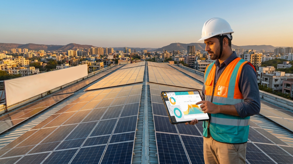
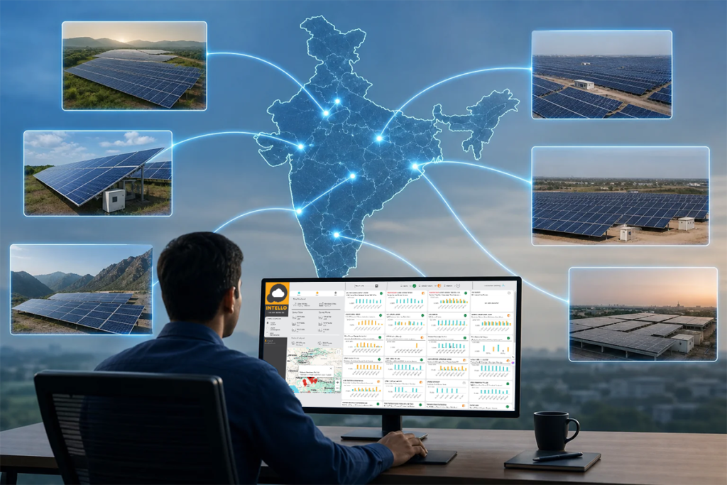
A solar monitoring app shows you what your plant is producing right now, how each string is performing against expectation, and whether a technician has actually acted on a fault, all from one screen. Most owners in India get handed this app at commissioning and never open past the home screen, which means they’re paying for visibility they never use.
Key Takeaways
- Home screen basics: Daily, monthly, and lifetime generation, plus current power output compared against expected generation for that hour.
- String-level data catches losses first: A drop in one string’s current, not the whole inverter, is usually where soiling, shading, or a loose connector shows up months before the monthly bill reflects it.
- Fault alerts have severity levels: Communication loss, inverter trip, and grid fault alerts are not equal; only some need same-day action.
- Visit logs are proof, not paperwork: Timestamped, geo-tagged technician logs with photos are what separate a real service visit from a missed one.
- The app doesn’t clean panels or tighten connectors: It only tells you when someone needs to. Monitoring without a maintenance team behind it is half a solution.
At a Glance: What Each Screen Shows
| App Screen | What It Shows | Who Should Check It |
|---|---|---|
| Home / Overview | Live power output, daily and lifetime generation | All owners, daily |
| String-level yield | Current and voltage per string | Commercial owners, weekly |
| Performance Ratio (PR) | Actual vs expected yield percentage | All owners, weekly |
| Fault alerts | Trips, communication loss, grid faults | All owners, real-time |
| Technician visit log | Timestamp, location, signature, photos | Site managers, per visit |
| Inverter health | Temperature, frequency, connectivity status | O&M teams, weekly |
| Multi-site view | Site-by-site comparison for portfolios | Commercial/EPC owners, weekly |
1. The Home Screen: Generation at a Glance
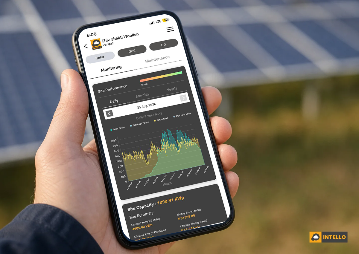
The home screen is a snapshot, not a diagnosis. It usually shows current power output in kW, how much energy the system has generated today, this month, and since commissioning, often with a small graph tracking output against the hour of day.
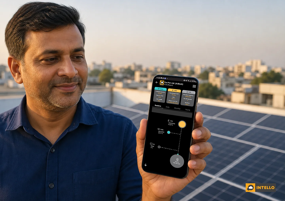
What most owners miss is the comparison line: expected generation for that hour based on weather and plant capacity, sitting right next to actual output. A gap between the two lines is the first sign something needs attention, whether that’s cloud cover, a tripped inverter, or dirty panels. If your bill hasn’t dropped the way it should have, this is the screen to check first, alongside a deeper look at why your solar bill is still high after installation.
2. String-Level Yield: Where Losses Actually Hide
String-level yield data matters because it isolates a fault to a specific set of panels instead of blaming the whole inverter. A drop in one string’s current, while neighbouring strings stay flat, usually points to shading, soiling, or a loose MC4 connector rather than a system-wide problem.
Most inverter-level apps only report a total DC input, which averages out the problem. A 15% drop in one string out of eight strings barely shows up as a 2% dip at the inverter level, easy to miss for weeks. String-level monitoring, delivered through custom RTUs rather than basic dataloggers, catches this within a day or two. Commercial owners managing multiple strings across several roofs should read RTU vs datalogger solar monitoring comparison before assuming their current hardware even captures this level of detail.
This screen is also where you’ll spot early signs of degradation. Comparing the same string’s output year over year, adjusted for irradiance, tells you whether panels are ageing normally or something is accelerating the decline.
3. Performance Ratio and Specific Yield Screens
What does performance ratio actually measure?
Performance ratio measures how much of a plant’s theoretical maximum output it actually delivered, expressed as a percentage, after accounting for irradiance, temperature, and system losses. A well-maintained plant in India typically runs 75-82% PR; anything consistently below that signals a maintenance gap.
The specific yield screen, usually shown in kWh per kWp, lets you benchmark your plant against similar-sized systems in your region. It’s the number that answers the question owners actually care about: is my solar ROI on track, or am I quietly losing money to preventable losses?
Both metrics work best as trends, not single-day readings. A PR that slides from 79% to 71% over three months, even with stable weather, is a stronger signal than any single alert.
4. Fault Alerts: What Triggers Them and What They Mean
What kind of fault alerts does a solar monitoring app send?
A solar monitoring app typically sends four alert types: inverter trip, string fault, communication loss, and grid or voltage fault, each carrying a different urgency. Inverter trips and grid faults usually need same-day attention; communication loss can wait a day if weather explains it.
Not every alert deserves a panicked call to your O&M provider. A communication loss alert during a monsoon storm probably means the GPRS or WiFi signal dropped, not that the plant stopped generating. A string fault alert that persists for more than a few hours, though, usually means physical intervention is needed, a loose connection, a blown fuse, or module damage. Understanding this distinction is covered in more depth in how IoT sensors detect solar faults before they cost you.
Good apps let you set custom thresholds, so a 5% dip triggers a low-priority notice while a 20% dip triggers an urgent one. If your current app sends every fluctuation as an identical red alert, that’s a sign the platform wasn’t configured properly during onboarding, not that your plant is constantly failing.
5. Technician Visit Logs and Photographic Reports
A visit log with a timestamp and GPS location proves a technician was physically on-site, not just that a job was marked “completed” in a spreadsheet somewhere. Photographic before-and-after shots of panel cleaning or a repaired connector add a layer most AMC contracts don’t specify but every owner should ask for.
Customer signature capture at the end of a visit closes the loop further. It’s the difference between an O&M company claiming a quarterly cleaning happened and having documented proof, useful both for your own records and for any future warranty claim dispute. If you’re unsure what your current AMC actually guarantees on this front, what is included in a solar AMC contract walks through the fine print worth checking.
6. Inverter and Device Health Screens
Beyond generation, the app tracks the health of the hardware itself: inverter temperature, output frequency, and whether the monitoring device is still communicating. A rising temperature trend over weeks often precedes a heat-related shutdown, giving you a window to schedule inverter servicing before it fails during peak generation hours.
Connectivity status matters more than owners realise. Most remote monitoring runs on an M2M SIM for cellular data transmission; a device flagged “offline” for more than a few hours usually means a SIM or network issue, not a plant failure, but it still needs checking so you’re not flying blind. This screen is also where servicing schedule reminders typically appear, nudging you before the next scheduled inverter maintenance window rather than after something breaks.
7. Multi-Site and Portfolio Views for Commercial Owners
Owners or EPCs managing several sites need a portfolio view that ranks plants by performance ratio side by side, not a dozen separate single-site logins. This screen typically flags the worst-performing site first, so attention goes where it’s actually needed instead of wherever you happened to check last.
For sites running alongside diesel generators, this view often includes DG-PV synchronisation status, confirming the controller is correctly balancing solar and generator load without tripping either source. Sites with export restrictions will also show zero export device status here, confirming the plant isn’t pushing power back into the grid in violation of DISCOM terms. Commercial owners running multiple rooftops should compare setups in centralized solar monitoring for multiple sites to see what a properly consolidated dashboard should include.
Is a Solar Monitoring App the Same as Solar Maintenance?
No, a solar monitoring app only reports data; it doesn’t clean panels, tighten connectors, or replace a failed fuse. It tells you a problem exists and roughly where, but someone still has to physically act on that alert for the plant to actually recover its output.
This is the gap that trips up a lot of owners who were sold “monitoring” as if it were a complete solution. An app that flags a 12% string loss is only useful if it’s paired with an O&M team that responds within a set turnaround time, not a support ticket that sits unanswered for two weeks. Preventive maintenance, string balancing, and hardware checks are what actually convert an alert into a fixed system, a distinction worth understanding fully in preventive vs breakdown solar maintenance: the real cost.
How Often Should You Actually Check the App?
Check the home screen daily for a quick generation glance, review performance ratio and string-level data weekly, and act on red-severity fault alerts the same day they arrive, ignoring low-severity notices unless they persist past 24 hours.
Residential owners with a single small system can get away with a weekly check-in, since a home rooftop rarely has more than two or three strings to watch. Commercial owners running 50kW or more, or portfolios spread across cities, need someone assigned to review the dashboard daily, because the cost of a missed string fault compounds fast at that scale, directly eating into solar O&M best practices around uptime protection.
Getting More Out of the App You Already Have
Most owners were shown the app once, at handover, by an installer focused on commissioning paperwork, not on teaching someone to actually use string-level data or configure alert thresholds. That’s a training gap, not a product flaw, and it’s fixable in a single call with whoever manages your monitoring platform.
Ask your O&M provider to walk you through setting custom alert thresholds for your specific plant size, so you stop getting flooded with low-priority notifications. Ask what the escalation path looks like when a red alert fires, who gets notified, and what the guaranteed response time is under your contract. If those answers aren’t clear, or your current app never shows string-level or visit-log data at all, that’s worth flagging.
Intello runs its monitoring through custom-designed RTUs feeding a centralised dashboard, backed by 150+ on-payroll solar technicians who log every visit with location, timestamp, and photographic proof. Existing customers can review their own plant data anytime through the Intello monitoring portal. If you’re evaluating whether your current setup actually covers what this article walked through, request a quote for a plant assessment, or learn more about Intello’s approach to combining monitoring with hands-on O&M across India.