
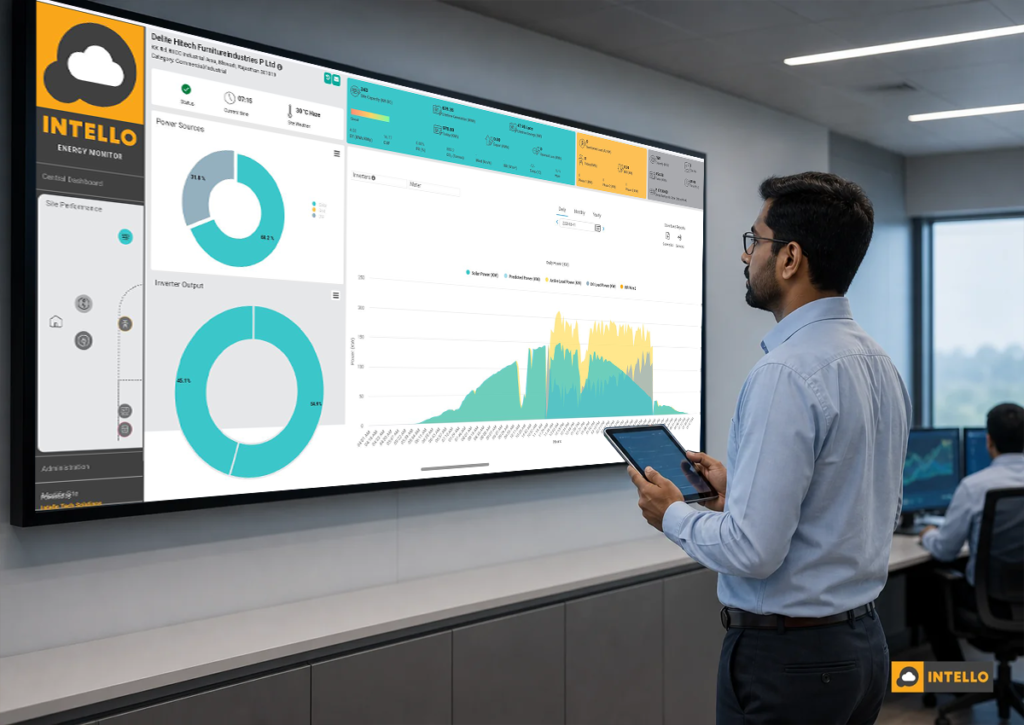
A solar remote monitoring dashboard should show you five things at a glance: real-time generation against an expected baseline, performance ratio, string-level current and voltage, inverter health, and live alerts routed to a named technician. If your current dashboard only shows a total kWh number and a green “system online” light, it is hiding the exact data that reveals underperformance on day one instead of month three.
Key Takeaways
- Generation vs expected output: A single cumulative kWh figure tells you almost nothing. The dashboard needs a modeled expected curve to compare against, so a 6% dip on a clear day gets flagged instead of buried in a monthly average.
- Performance Ratio (PR) as the core health metric: A healthy Indian rooftop or ground-mounted system typically runs a PR of 75-85%. Anything sliding below that band for more than a couple of days needs investigation, not a wait-and-see approach.
- String-level visibility is non-negotiable: Plant-level totals can look normal while one string in a combiner box is running 20% low. Only string-by-string current and voltage data catches this before it shows up on the electricity bill.
- Alerts need an owner, not just an icon: An alert that sits unread in a portal is worthless. It should reach a technician’s phone with enough detail to act, and the resolution should be logged with a timestamp and photo.
- Historical data protects your warranty and ROI case: Degradation trends, exportable reports, and dated fault logs are what you hand an installer or manufacturer when a warranty claim needs proof.
Solar Remote Monitoring Dashboard at a Glance
| Metric Category | What It Reveals | Ideal Refresh Rate |
|---|---|---|
| Generation vs expected output | Whether the plant is producing what irradiance and system size predict | 15 min or less |
| Performance Ratio (PR) | Overall system health as a single comparable percentage | Daily, with intraday trend |
| String-level current/voltage | Individual string faults, shading, or connector issues | 15 min or less |
| Inverter status and fault codes | Trips, overheating, DC/AC ratio problems | Real time |
| Irradiance and weather overlay | Whether a dip is weather-driven or a genuine fault | 15 min or less |
| Real-time alerts | Immediate notice of zero generation, string deviation, comms loss | Instant, pushed to technician |
| Historical trend and degradation | Year-over-year decline versus warranty curve | Monthly/annual export |
| Multi-site portfolio view | Ranking of sites by PR or downtime for prioritized visits | Daily |
Most solar asset owners in India learn about a fault the same way: an electricity bill arrives higher than expected, or a routine site visit turns up a snapped connector that has been silently costing them yield for weeks. A properly built solar remote monitoring dashboard exists to close that gap. It should tell you something is wrong the same day it starts, not the same month you finally look closely enough to notice. This guide walks through the specific metrics that separate a genuinely useful dashboard from a decorative one, and why each matters for commercial owners, residential systems, and the solar O&M teams managing them.
1. Real-Time Generation vs Expected Generation
Total generation is the number every solar app shows first, and it is also the least useful one on its own. A plant can generate a respectable-looking number all month while running well below what it should, especially if the shortfall builds slowly. The fix is simple: the dashboard needs to plot actual output against a modeled expected generation curve, built from local irradiance data, panel rating, tilt, and orientation.
When actual output drops 5% below the expected curve, that should register as a soft flag. A 10% or greater gap sustained across a few hours should escalate to an active alert. Without this comparison, an owner has no reference point. They only have a raw number that means nothing until it is compared against last year’s same week, and by then the loss has already compounded for weeks.
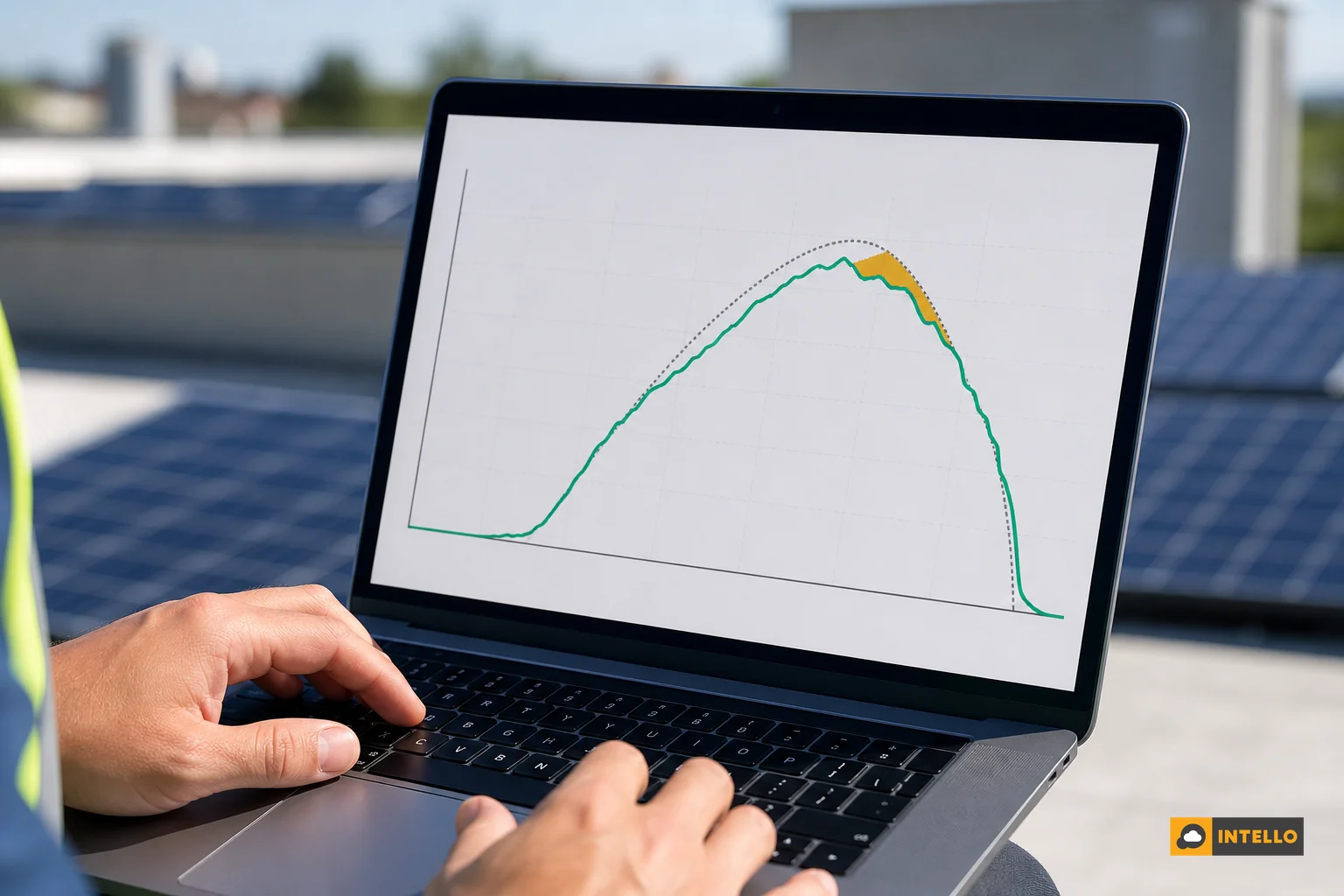
This is also where centralized platforms outperform a single inverter’s built-in app. Inverter apps typically show only what that inverter measured, with no external benchmark. A dedicated monitoring system layers in weather data and historical performance so the deviation is visible immediately, not inferred later. For owners managing several sites, this comparison becomes even more important, which is why centralized solar monitoring across multiple sites typically standardizes this expected-output baseline across every location on one login.
2. Performance Ratio (PR) Tracking
Performance Ratio, or PR, measures how much of the theoretically available energy a plant actually converts into usable output, accounting for temperature losses, wiring losses, and inverter efficiency. It is the closest thing solar has to a single vital sign. A well-maintained system in Indian conditions should run a PR somewhere between 75% and 85%, depending on technology and site conditions. A PR that drifts below 70% for more than a couple of days is not a rounding error; it usually points to soiling buildup, a string fault, or inverter clipping.
The mistake many dashboards make is showing PR as a single lifetime average. That number is almost useless for spotting a new problem because one bad week barely moves a two-year average. A dashboard worth using should show daily PR and a rolling 30-day trend line side by side, so a downward slope is visible well before it drags the annual figure down. If you want a deeper walkthrough of reading this number correctly, our post on what your solar dashboard should show you daily breaks down the daily-check habit worth building.
3. String-Level and Combiner Box Data
Here is where most basic monitoring setups fall short. A plant-level total can look completely normal even while one string inside a combiner box is producing 15-20% less current than its neighbors. Averaged across dozens of strings, that shortfall barely dents the total number, but it is real lost revenue every single day it goes unnoticed.
A dashboard built for actual asset management needs to show current and voltage for each string, compared automatically against the average of sibling strings on the same combiner box. When one string deviates by more than roughly 10-15% from its peers under similar irradiance, that is a strong signal of a loose connector, a damaged cable, a failed bypass diode, or physical shading nobody has walked the site to check. This kind of imbalance typically shows up in the data days or weeks before it is visible in a monthly yield report, which is exactly the lead time an O&M team needs to schedule a fix before it becomes a bigger repair.
For ground-mounted plants especially, where hundreds of strings run across a large field, this granularity is the difference between catching a fault during a scheduled visit and discovering it during an annual audit. Our detailed breakdown on RTU vs datalogger solar monitoring covers which hardware actually delivers this level of detail versus which only reports plant totals.
4. Inverter Health and Status Metrics
Inverters rarely fail without warning signs. Before a full trip, most units show creeping symptoms: rising internal temperature, a shifting DC-to-AC ratio, intermittent fault codes, or a pattern of restarts that a person checking the site once a month would never notice. A useful dashboard surfaces these as tracked metrics, not just a binary “online/offline” status.
At minimum, the inverter panel of a dashboard should log:
- Real-time DC input and AC output, so a widening gap between the two flags an efficiency problem.
- Operating temperature, since sustained overheating shortens component life and often precedes a trip.
- Fault and trip history with timestamps, so a pattern of repeated trips at the same time of day (often linked to grid voltage fluctuations) becomes visible.
- Firmware and communication status, catching silent data-loss issues before they masquerade as “zero generation.”
Inverter issues remain one of the most common causes of unplanned solar downtime in India, and catching the early signals is far cheaper than a mid-season replacement.
5. Irradiance, Weather and Soiling Context
Without weather context, a dashboard cannot tell the difference between a genuinely cloudy day and an actual system fault, and that ambiguity causes both false alarms and missed real ones. A good dashboard overlays local irradiance readings, either from an on-site pyranometer or a reliable weather API, directly against the generation graph.
This context also supports soiling estimates. When actual output consistently underperforms the irradiance-adjusted expectation on clear days, dust and grime accumulation is the most likely cause, and that data point is what justifies scheduling a cleaning visit rather than guessing on a fixed calendar. For a regional breakdown of how soiling loss and cleaning frequency vary from Rajasthan’s dust belts to Mumbai’s coastal humidity, see our regional guide to solar cleaning by climate zone.
6. Real-Time Alerts and Escalation Workflow
An alert that nobody sees is not an alert; it is a log entry. The single biggest gap between a decorative dashboard and one that actually protects ROI is what happens the moment a threshold is crossed. The dashboard needs defined triggers for at least these events:
- Zero generation during daylight hours, which usually means a full inverter trip or a communication failure.
- String-level deviation beyond the normal tolerance band for that combiner box.
- Inverter fault codes or repeated trip-and-restart cycles.
- Communication loss from the RTU or datalogger itself, since a silent monitoring device is worse than no monitoring at all.
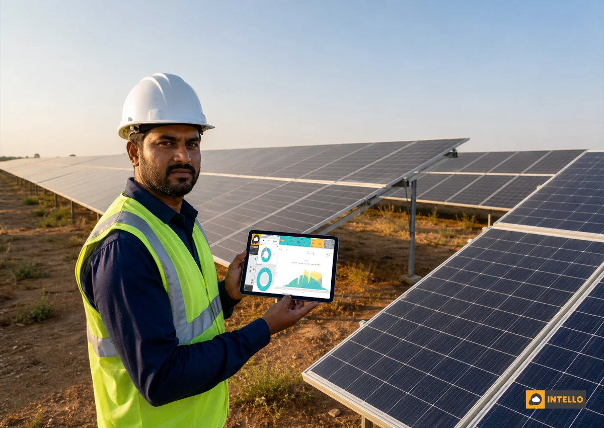
Those triggers only matter if they reach a person who can act. This is where an integrated mobile app changes the outcome: a real alert should push to the assigned technician’s phone with the site name, the specific string or inverter affected, and enough diagnostic detail to plan the visit before arriving on-site. Intello’s platform closes that loop by pairing the dashboard with a mobile app that captures location, timestamp, customer signature, and photographic proof once the issue is resolved, so the alert has a documented end, not just a start. Our piece on must-have features in a solar monitoring mobile app covers exactly what field technicians actually rely on day to day.
7. Historical Trends, Degradation and Reports
A dashboard that only shows the present moment is only half useful. Solar panels degrade gradually, typically around 0.5-0.8% per year depending on the module technology, and manufacturers publish a warranty curve that guarantees output stays above a defined threshold for 25 years. Without a dashboard tracking actual year-over-year output against that promised curve, an owner has no way to know if their system is degrading faster than it should, which is exactly the kind of evidence needed for a warranty claim.
Beyond degradation, the historical view needs to export clean monthly and annual generation reports. These support ROI calculations, feed into audits for commercial owners, and give EPC companies a defensible record to hand clients. If a warranty dispute ever arises, dated performance logs are often the deciding factor between a claim getting approved or rejected. Our step-by-step guide to the solar panel warranty claim process in India explains exactly what documentation manufacturers expect, and a dashboard with strong historical export makes that process considerably faster.
8. Multi-Site and Portfolio View for EPCs and Asset Owners
For solar EPC companies and commercial owners managing installations spread across multiple states, a dashboard built around a single site is not enough. The portfolio view needs one login covering every site, with the ability to rank locations by PR, downtime hours, or open alert count. This lets a small O&M team prioritize the worst-performing site first instead of working through a fixed rotation that ignores which plant actually needs attention today.
This is also where ground-mounted assets differ operationally from rooftop installations, since larger plants tend to generate far more string-level data points and need dashboards that can aggregate without losing the granularity discussed earlier. Our ground-mounted solar plant maintenance checklist covers common blind spots specific to larger, distributed sites. If you are still comparing platforms and haven’t settled on one, our guide on how to choose a solar monitoring system in 2026 walks through the selection criteria in more depth.
Choosing Between a Basic Logger Dashboard and a Full O&M Platform
Not every dashboard on the market delivers everything described above. Many inverter manufacturers ship a basic app that covers only total generation and a status light. Generic dataloggers add some historical charting but rarely go deeper than plant-level totals. An integrated O&M platform is built specifically to close the gap between spotting a fault and getting a technician to fix it.
| Capability | Basic Inverter App | Generic Datalogger Dashboard | Integrated O&M Platform |
|---|---|---|---|
| String-level current/voltage | No | Sometimes, limited | Yes |
| Expected vs actual generation | No | Basic | Yes, with irradiance modeling |
| PR trend tracking (daily + monthly) | Rarely | Yes, monthly only | Yes, daily and monthly |
| Real-time alert routing to technician | No | Email only | Yes, app push with dispatch |
| Mobile app with photo/signature proof | No | No | Yes |
| Multi-site portfolio ranking | No | Limited | Yes |
| Connected to on-ground repair team | No | No | Yes |
The gap matters most at the moment a fault actually occurs. A basic app tells you something changed. An integrated platform tells you what changed, how urgent it is, and dispatches someone qualified to fix it, then documents the fix. That closed loop is what protects solar ROI over the 25-year life of an installation, rather than just reporting on it after the fact.
Frequently Asked Questions
How often should a solar remote monitoring dashboard refresh data?
Generation, string-level current, and inverter status should refresh at least every 15 minutes. Real-time alerts for events like zero generation or an inverter trip should be instant, pushed the moment the threshold is crossed rather than waiting for the next scheduled data pull.
What PR is considered healthy for a solar system in India?
Most well-maintained rooftop and ground-mounted systems in Indian conditions run a Performance Ratio between 75% and 85%. A sustained drop below 70% usually signals soiling buildup, a string fault, or an inverter issue that needs investigation.
Can a dashboard alone fix an underperforming solar system?
No. A dashboard identifies and flags the problem, but resolving it still requires a technician to inspect the affected string, inverter, or panel on-site. What a good dashboard does is cut the time between the fault occurring and someone finding out about it, often from weeks down to hours.
Do residential solar systems need string-level monitoring too?
Smaller residential systems have fewer strings, but the same principle applies: a single underperforming string can quietly reduce output by 10-15% without changing the total generation number enough for a homeowner to notice. Our post on residential solar AMC benefits in India covers what homeowners typically gain once proper monitoring is added to their maintenance plan.
How is a monitoring dashboard different from an AMC contract?
Monitoring is the detection layer; an AMC is the maintenance and repair commitment. A dashboard flags the fault, while the AMC defines who fixes it and how quickly. For a full breakdown of what should sit inside each, read our comparison on solar AMC vs O&M contract differences in India.
Get the Full Picture, Not Just a Status Light
Most solar asset owners in India do not lose ROI because their panels are bad. They lose it because their dashboard never told them anything was wrong until the electricity bill did. A dashboard that shows generation against expectation, tracks PR daily, breaks output down to the string level, monitors inverter health, and routes real alerts to a real technician is not a luxury feature; it is the baseline for protecting a 25-year investment.
Intello’s monitoring platform, backed by custom-designed RTUs and a team of 150+ solar experts, is built around exactly this level of visibility, paired with the on-ground maintenance capacity to act on what the dashboard finds. If your current setup only tells you the system is “online,” it’s worth finding out what it is actually hiding. Request a quote to see how a properly built monitoring dashboard applies to your specific site, or explore your options through a portal login if you’re already an Intello customer. You can also learn more about our approach or contact us directly to walk through what your current dashboard might be missing.
