
A portfolio owner with 12 rooftop sites across Gujarat, Maharashtra, and Tamil Nadu doesn’t need more data, they need the right eight numbers on one screen. The multi site solar portfolio dashboard kpis that actually matter are performance ratio, generation vs target, inverter uptime, fault frequency, string-level deviation, specific yield, soiling loss, and alert response time. Track these eight and underperforming sites surface within days, not months.
Key Takeaways
- Performance ratio below 75%: signals a site is underperforming relative to the sunlight it received, regardless of raw kWh numbers.
- Generation vs target deviation past 10%: is the single fastest way to catch a shortfall before it eats a full billing cycle.
- Inverter uptime under 98%: across a portfolio usually points to a hardware or communication issue at a specific site, not a fleet-wide problem.
- Fault frequency ranking: lets a single O&M team prioritise which of 20+ sites gets a technician first, instead of visiting everyone on a fixed schedule.
- Centralised KPI tracking: cuts unnecessary site visits by flagging only the plants where the data confirms a real problem.
Multi-Site Solar Dashboard KPIs at a Glance
| KPI | Healthy Range (India) | Red Flag Threshold | What It Tells You |
|---|---|---|---|
| Performance Ratio (PR) | 75-85% | Below 70% | Overall efficiency after weather-normalisation |
| Generation vs Target | Within ±5% | Below -10% | Whether the site is meeting design yield |
| Inverter Uptime | Above 98% | Below 95% | Hardware or communication reliability |
| Fault Frequency | <2 faults/month/site | >5 faults/month | Maintenance priority ranking |
| String DC Deviation | Within 5% of array average | Above 10% | Early string fault or shading issue |
| Specific Yield (kWh/kWp) | Region-dependent, 3.5-5.5 | Below regional benchmark by 15% | Capacity-normalised comparison across sites |
| Soiling Loss | <3% between cleanings | >8% | Cleaning cadence adequacy |
| Alert Response Time | Under 24 hours | Over 72 hours | O&M team responsiveness per site |
1. Performance Ratio (PR) Per Site
Performance ratio strips out the weather and tells you how efficiently a site converts available sunlight into usable power. Two sites can generate the same raw kWh number and still tell completely different stories if one received far more irradiance than the other. That’s why raw generation comparisons across a portfolio are misleading on their own.
In Indian conditions, a well-maintained rooftop or ground-mounted plant should sit somewhere between 75% and 85% PR. Anything consistently below 70% usually means soiling, string faults, or inverter clipping is quietly eating yield. A dashboard that surfaces PR per site, ranked lowest to highest, turns a portfolio review into a five-minute task instead of a spreadsheet exercise. For a deeper walkthrough of the metric itself, see our guide on how preventive maintenance protects performance ratio over time.
2. Generation vs Target (Actual vs Expected Yield)
Every solar site has a design estimate, an expected daily or monthly generation figure based on irradiance data and system size. Generation vs target compares what actually happened against that number. A deviation of more than 10% below target, sustained over a week, is the earliest reliable signal that something needs attention.
Intello’s IoT-enabled dashboard calculates this automatically for every site in a portfolio and flags shortfalls without anyone needing to pull historical weather data manually. Owners managing sites across different states, each with different irradiance profiles, get a single normalised view instead of comparing apples to oranges.
3. Inverter Uptime and Availability
Inverter uptime measures the percentage of daylight hours each inverter is actively converting power. A single inverter offline for even a few hours a day, across dozens of sites, adds up to real revenue loss that a monthly bill review will not catch in time.
Uptime below 98% for any inverter in the fleet usually points to a specific, fixable cause: a tripped breaker, a communication dropout, or a fault the site team hasn’t been alerted to yet. Tracking uptime at the inverter level, not just the site level, pinpoints exactly which unit needs a technician. Our breakdown of common inverter faults and warranty traps covers what typically causes these dips.
4. Fault Frequency and Mean Time to Resolve (MTTR)
Fault frequency ranks sites by how often they throw alerts in a given month. A site generating five times the faults of the portfolio average deserves a technician visit before a site that has been quiet for weeks, even if both are due for routine maintenance on the same calendar schedule.
Mean time to resolve, the average time between a fault being flagged and being closed out, is the companion metric. A dashboard showing both together tells an O&M manager not just where problems happen most, but whether the response process itself is working. This is where IoT sensors that detect faults before they cost you earn their value: catching an issue an hour after it starts rather than a month later during a bill review.
5. String-Level DC Current Deviation
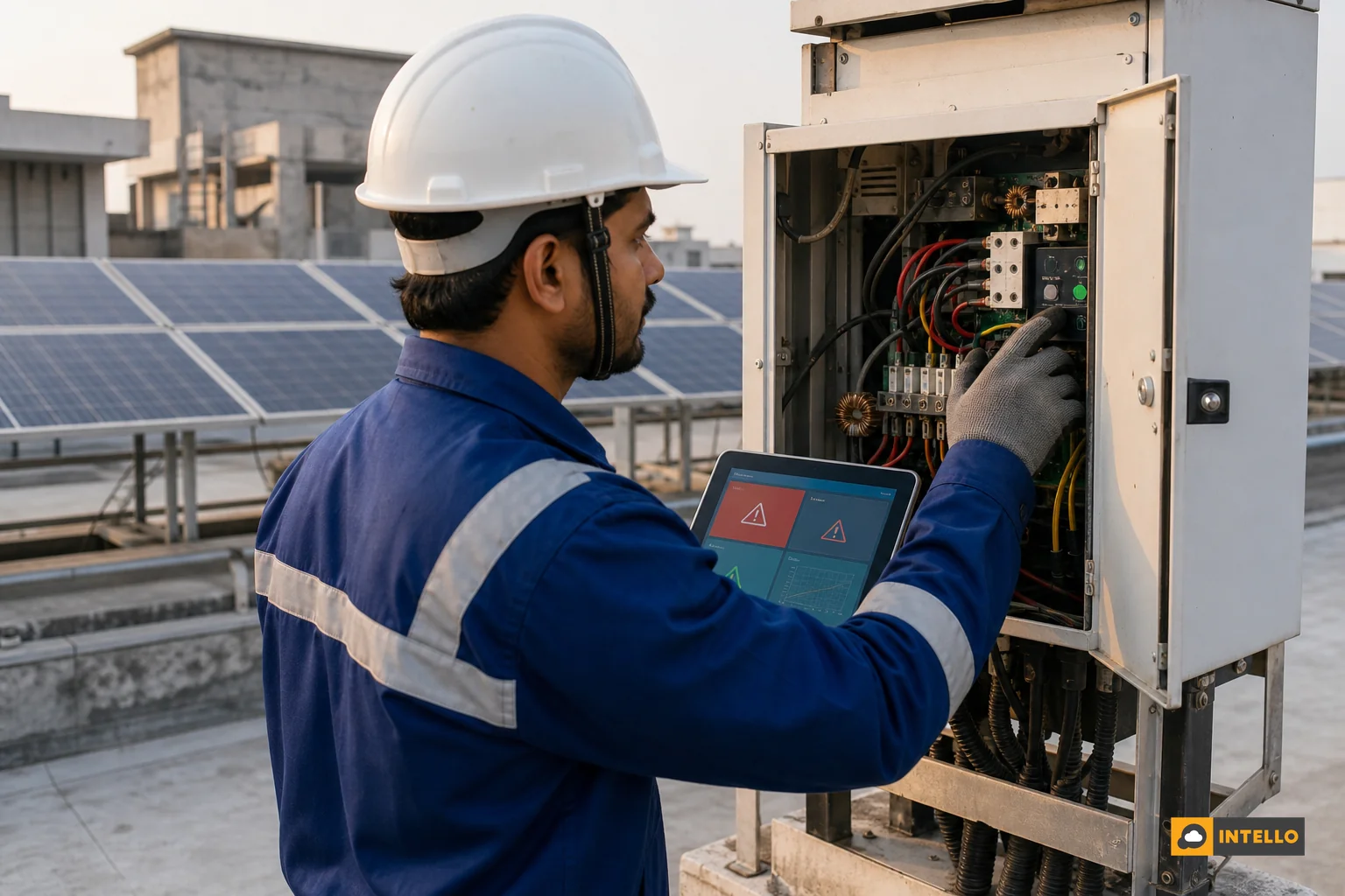
Inverter-level totals hide problems. If one string out of twelve drops 20% in output, the inverter-level number barely moves, and the loss goes unnoticed for months. String-level DC current monitoring compares each string’s output against the array average and flags any string deviating beyond a set threshold, typically 5-10%.
This is one of the biggest gaps between a basic monitoring setup and a proper portfolio dashboard. Custom RTUs that read string-level data, rather than off-the-shelf loggers pulling only inverter totals, make this KPI possible in the first place. Portfolio owners deciding between hardware options should read our comparison of RTU vs datalogger solar monitoring before locking in a fleet-wide monitoring standard.
6. Specific Yield (kWh/kWp) Benchmarking Across Sites
Specific yield normalises generation by installed capacity, expressed as kWh produced per kWp of installed capacity. It’s the metric that finally lets you compare a 50 kW rooftop in Jaipur against a 500 kW ground-mounted plant in Coimbatore on equal footing.
Across most of India, healthy specific yield ranges from roughly 3.5 to 5.5 kWh/kWp per day, depending heavily on region and season. A dashboard that ranks every site in a portfolio by specific yield against its regional benchmark turns dozens of disconnected numbers into a single prioritised list. This benchmarking approach is explored further in our piece on solar asset performance data compared across more than a hundred plants.
7. Soiling Loss and Cleaning Cycle Compliance
Dust and soiling behave very differently depending on region. A plant in Rajasthan can lose more output to dust in six weeks than a similar plant on the Kerala coast loses in six months. A portfolio dashboard needs to track soiling loss as its own KPI, not bundle it into a vague “performance issue” bucket, because the fix (cleaning frequency) is completely different from a hardware fix.
Tracking cleaning cycle compliance alongside soiling loss tells an owner whether a site’s scheduled cleaning cadence actually matches its regional dust exposure. For sites entering the monsoon season, the timing question changes entirely; our monsoon solar maintenance checklist covers what shifts when rain replaces dust as the main soiling risk.
8. Alert Response Time and Site Visit Turnaround
The final KPI measures the O&M team itself, not the solar equipment. Alert response time tracks how long it takes from a fault being raised to a technician acknowledging it, and site visit turnaround tracks how long until it’s physically resolved. Under 24 hours for acknowledgment and a defined SLA for resolution is a reasonable target for commercial portfolios.
This KPI matters most when negotiating or renewing an AMC contract, since it’s the metric most providers avoid putting in writing. Before signing anything, review what belongs in the fine print with our guide on red flags in solar AMC contracts.
Why Portfolio-Level KPI Tracking Matters for EPCs and Asset Owners in India
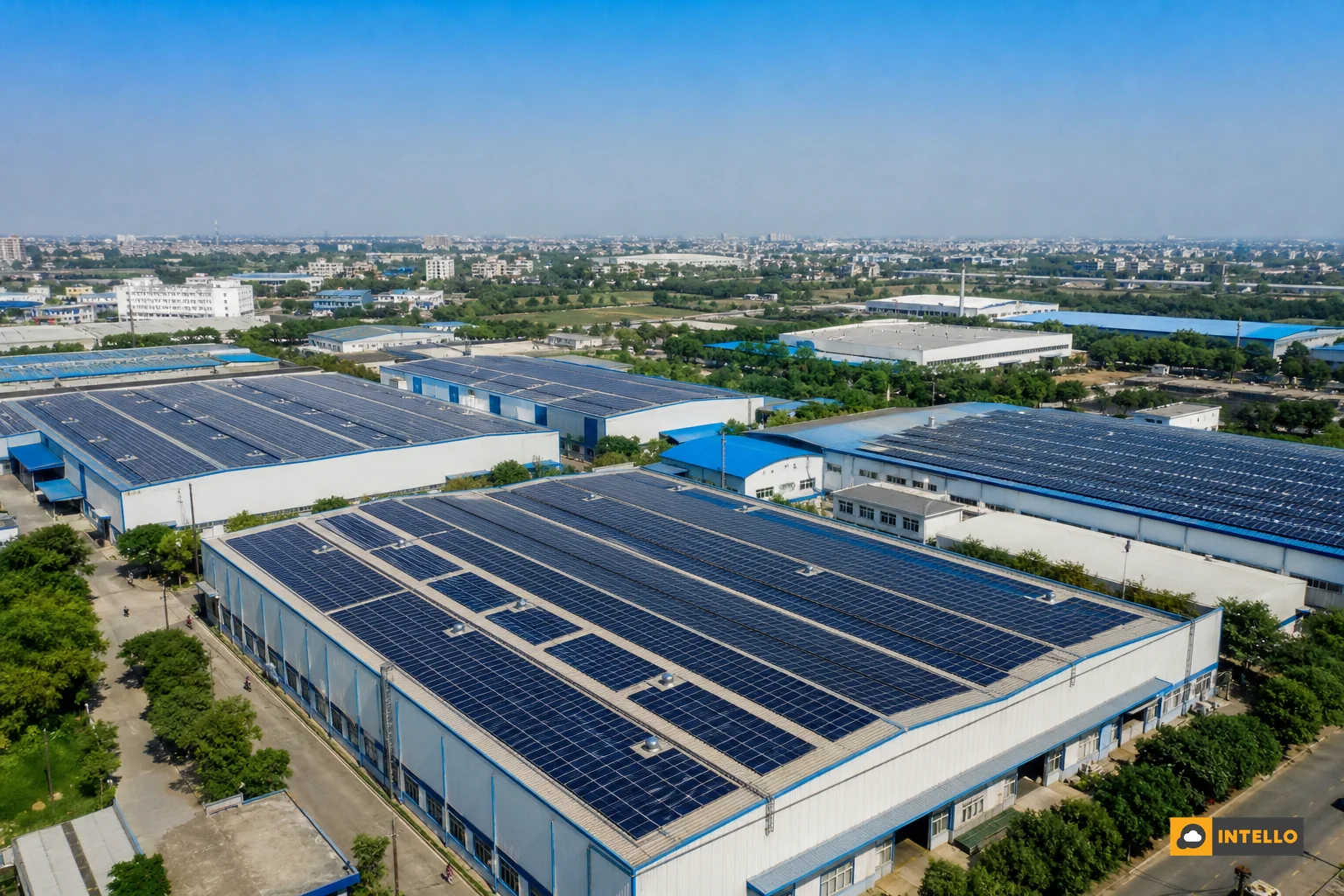
Managing ten or more sites spread across three or four states by manual spreadsheet is unmanageable past a certain scale. Someone has to log into separate inverter portals, pull separate reports, and manually compare numbers that aren’t even normalised the same way. That process breaks down exactly when it matters most, during a fault or a sudden generation drop.
IoT-enabled RTUs and monitoring dongles solve the data collection problem by feeding string and inverter-level readings into a single centralised dashboard in near real time. For EPCs managing client portfolios across India, this centralisation isn’t a convenience, it’s what keeps client trust intact when a site underperforms and the EPC needs to show, with data, exactly what happened and how fast it was fixed.
Portfolio owners running sites alongside diesel generators or under DISCOM export restrictions add another layer of complexity. If your fleet includes zero export configurations, our explainer on zero export solar setups in India covers what asset owners need to know before those sites go live. For a broader look at building the centralised monitoring setup itself, see our practical guide to centralized solar monitoring across multiple sites in India.
Intello builds this kind of tracking into its monitoring platform specifically for portfolios that span rooftop and ground-mounted assets across Indian states, backed by a team of solar experts who act on the KPIs rather than just displaying them. Data on its own doesn’t fix a string fault; a technician dispatched based on that data does.
FAQs on Multi-Site Solar Dashboard KPIs
What is a good performance ratio for Indian solar plants?
Most well-maintained plants in India run between 75% and 85% PR, though this varies with system design, inverter type, and regional temperature. A consistent drop below 70% deserves investigation.
How often should generation vs target be reviewed?
Weekly reviews catch shortfalls early. Monthly-only reviews often mean a site has already lost several weeks of avoidable yield before anyone notices.
Can one dashboard handle rooftop and ground-mounted sites together?
Yes, provided the KPIs are normalised (specific yield, PR) rather than compared as raw totals. A properly configured platform accounts for the different maintenance and monitoring needs of each site type within the same view.
Does portfolio dashboard monitoring replace on-site technicians?
No. It replaces guesswork about which site needs a technician first. The dashboard flags the problem; a trained team still has to fix it on the ground.
If your portfolio has grown past the point where spreadsheets and separate inverter apps can keep up, it’s worth seeing what a properly configured dashboard actually looks like across your sites. Request a quote from Intello to get a KPI-based monitoring setup mapped to your specific portfolio, or explore the platform yourself through the Intello portal login. To understand how Intello’s team of solar experts turns these KPIs into action on the ground, you can also learn more about Intello or contact us directly to discuss your current site count and maintenance gaps.